When it comes to understanding wars, for some people, a picture of the dead or of the injured or of the traumatized or of those made refugees can be worth ten million words. And, for at least some of us, a picture of where war is in the world can be worth at least a thousand.
What follows are two dozen pictures mapping war and militarism and the struggle for peace overlaid on a global image of nations. These are drawn from — and you can create your own with — an online tool for mapping militarism published by World Beyond War at bit.ly/mappingmilitarism. This tool has just been updated with new data. On many of the maps at that link, unlike with the static images that follow, you can scroll back in time to see changes over recent years.
By laying some important facts about war on the map, we’re able to recognize some ideas that rarely make it into prose. Here are a few examples:
- The war in Afghanistan and the foreign occupation of Afghanistan have officially ended, but a map of the nations with troops still occupying Afghanistan still looks like NATO colonialism.
- The list of locations of severe wars changes from year to year but sticks to a certain region of the world — a region in which none of the major producers of the weapons of war and few of the big spenders on war can be found — but from which the bulk of refugees flee and in which the biggest concentration of that violence labeled “terrorism” germinates, these being two of war’s many tragic consequences.
- The United States dominates the war business, the sale of weapons to other nations, the sale of weapons to poor nations, the sale of weapons to the Middle East, the deployment of troops abroad, spending on its own military, and the number of wars engaged in.
- Only Russia is anywhere close to the U.S. in weapons dealing, and this pair of countries nearly splits the vast majority of the nuclear weapons possessed on earth.
- Efforts toward peace and disarmament are widespread and coming largely from the less-armed, less bellicose parts of the world, but not entirely.
- And those governments that are otherwise doing well by the world tend to be those not engaged in warfare (“humanitarian” warfare or otherwise).
The presentation that follows can also be found as a “prezi” (a variation on what’s more commonly called a powerpoint and used to be called a slide show). You can grab the prezi for your own use at the World Beyond War events resources page.
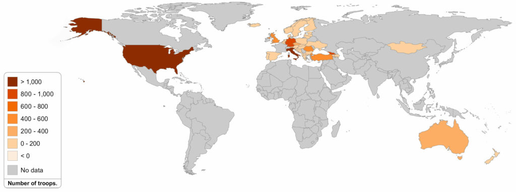
WHICH NATIONS HAVE TROOPS IN AFGHANISTAN?
As noted in a petition to end the war in Afghanistan, which you are welcome to sign, the U.S. military now has approximately 8,000 U.S. troops in Afghanistan, plus 6,000 other NATO troops, 1,000 mercenaries, and another 26,000 contractors (of whom about 8,000 are from the United States). That’s 41,000 people engaged in a foreign occupation of a country, 15 years after the accomplishment of their stated mission to overthrow the Taliban government.
The sources for all the data in all the maps are noted on the map tool at bit.ly/mappingmilitarism. In this case, the source in NATO, which claims 6,941 U.S. troops in Afghanistan. The slightly higher 8,000 figure comes from the U.S. commander in December expressing a hope to reduce the troop number to 8,400 by January 20.
Take a look at where the troops occupying Afghanistan all come from. It’s NATO plus the U.S.’s kangaroo sidekick down under plus 120 Mongolians. It’s the world’s self-appointed but generally resented policemen and a few hired security guards. Here’s an argument that they are doing more harm than good.
Head to the next page by clicking the number 2 below to see where all the major wars in the world are.


