
By David Swanson, Executive Director, World BEYOND War, May 6, 2019
World BEYOND War has just released an updated 2019 mapping of militarism in the world.
Open the mapping system, check out, and customize the maps here.
Here are some examples of what the map system can show. (You’ll find detailed numbers and sources and dislpay options at the link above.)
Where wars are present that directly and violently killed over 1,000 people in 2018:

Where wars are present and where wars come from are two different questions. If we look at where money is spent on wars and where weapons for wars are produced and exported, there is no overlap with the map above.
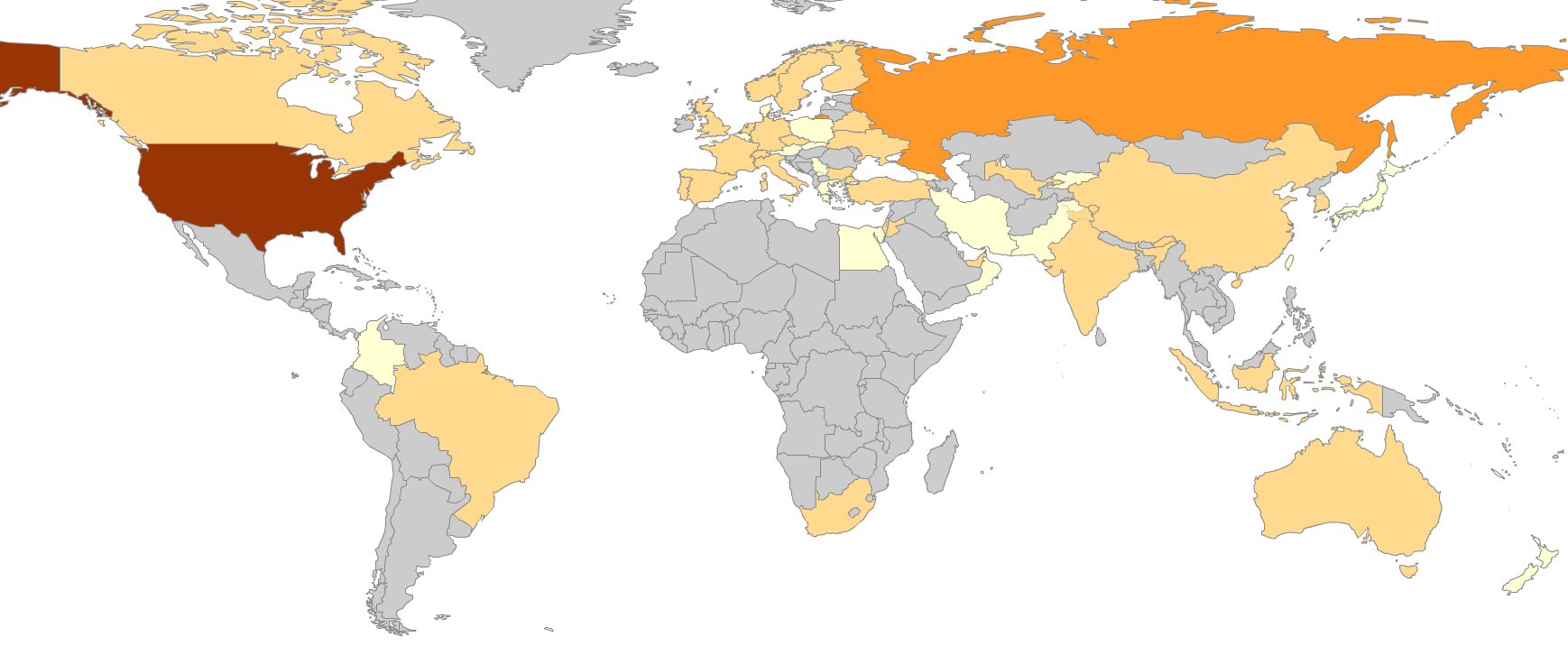
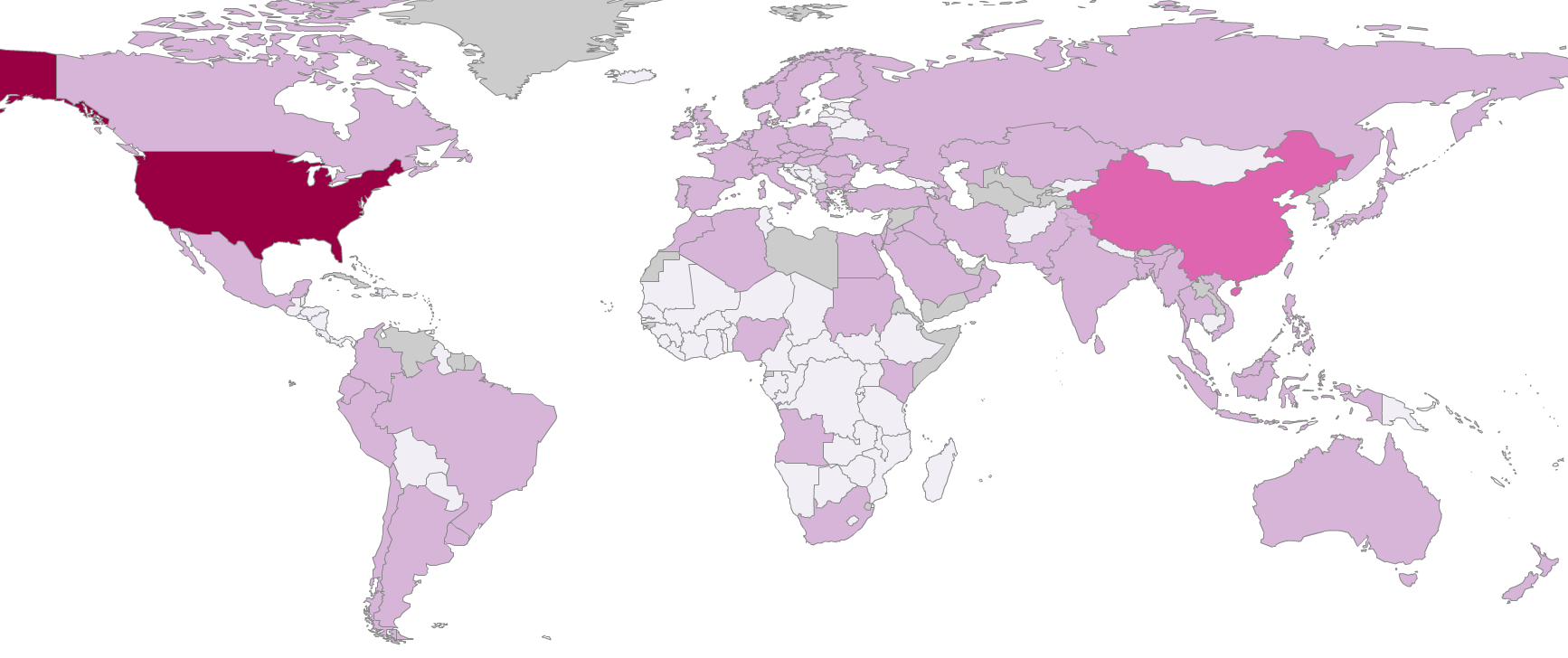
Here’s a map showing countries color-coded based on the amount of weapons exported to other governments from 2015 to 2018:
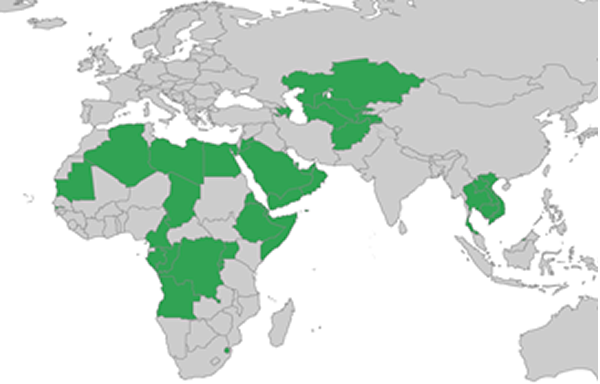
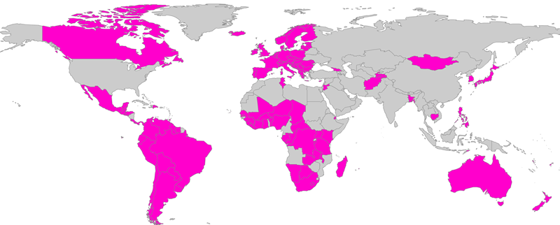
Here are dictatorships that the United States sells or gives weapons to (and in most cases gives military training to):
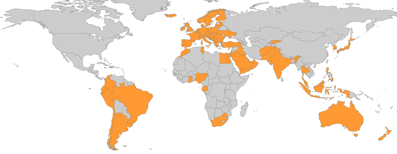
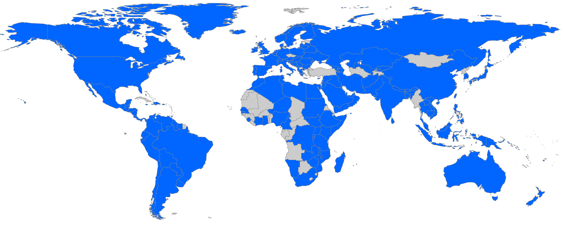
These countries purchase U.S. weapons and report on it to the United Nations:
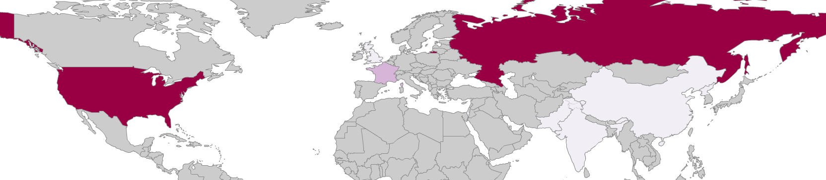
This next map shows countries color-coded based on how much they spend on their own militarism:
Here are countries colored based on how many nuclear weapons they have:
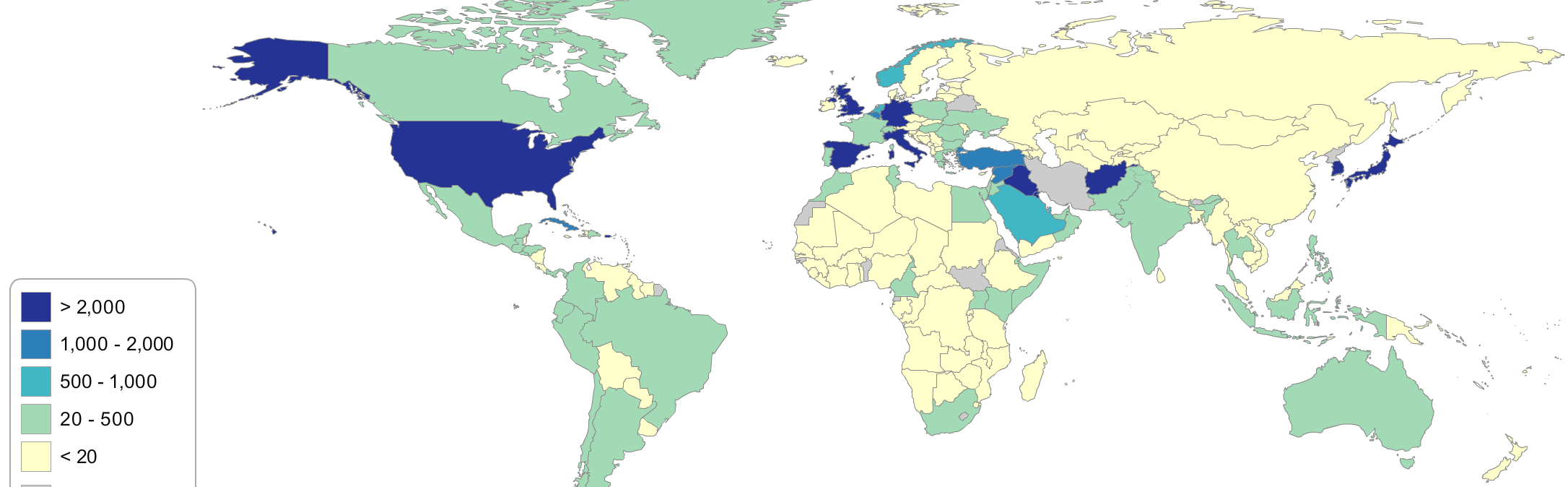
In the next map, every color but gray indicates the permanent basing of some number of U.S. troops, not counting special forces and temporary deployments.
The map system includes numerous maps illustrating steps toward peace. It also allows scrolling back through time. Here are the nations that had signed the new treaty to ban all nuclear weapons at this time last year:
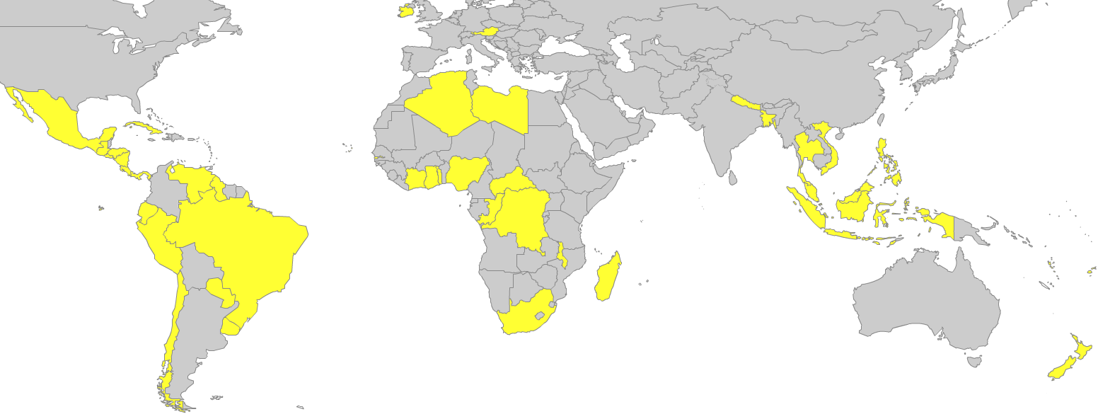
And here they are now:

This one shows which nations are members of the International Criminal Court:
This one shows from which nations people have signed World BEYOND War’s pledge to help try to end all wars:
That pledge can be signed at http://worldbeyondwar.org/individual
The maps and more information about them can be found at
https://www.worldbeyondwar.org/wp-content/uploads/statplanetnew/StatPlanet_Cloud.html
See also: Militarism Mapped 2018.


10 Responses
This is a wonderful map! I posted it to my friends and printed copies for others who are not online.
At the end of the 2nd World War the US started it`s march for vWorld Domination.
Wouldn’t it be wonderful if that were true and the horrors of the 1770s to 1940s didn’t exist!
The only genuinely informative statistic for the quantities cited is the per-capita amount.
Comparing figures for China — more than a billion people — with ministates with a few tens of thousands of inhabitants (and everything in between) does not really reflect the reality.
Maps are very useful to allow us to grasp the forces at work to inhibit us from the necessary resources and cooperation to survive ‘global warming’ ..
Arni, Community Pathfinder
nobody wants war!
Are you sure? It appears that the powerful leaders who want more power will use their citizens to kill other citizens of other countries!
Really important maps – would be much better if sources were identified.
They are
Please look closely
Thanks
Ha! Tell that to Cheney, Bush for example.