
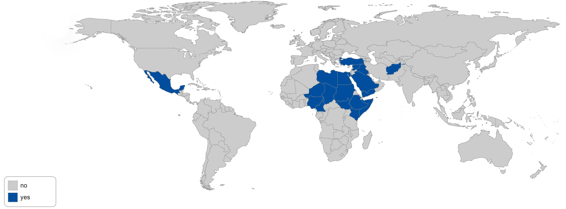
WHERE ARE THE WARS?
The three maps immediately below indicate where wars resulting in 1,000 deaths or more during the year have been located in 2016, 2015, and 2014.
2016:
2015:
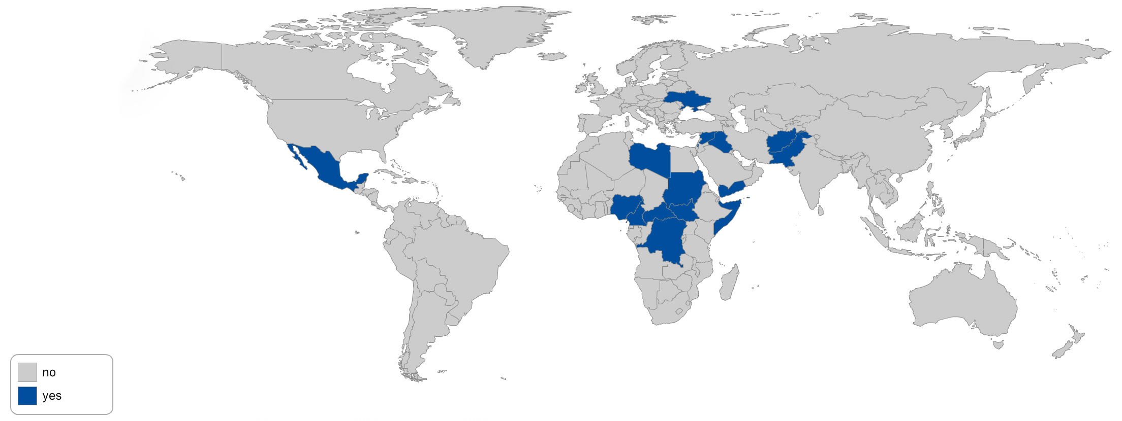
2014:
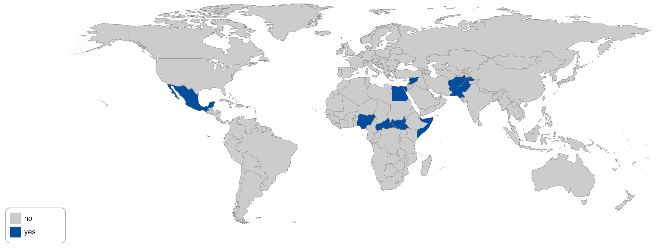
There is in the maps above a major overlap with those nations possessing large quantities of oil, but virtually no overlap with those nations producing large quantities of weapons.
There is also a major overlap with those nations “liberated” or otherwise bombed by the United States during the past 16 years. Afghanistan, Iraq, Libya, Syria, Pakistan, Somalia, and Yemen — all bombed by the U.S. military in recent years — do not know peace. Nor do some of their neighbors into which weapons and violence have overflowed.
The map below, in red, orange, and yellow, shows countries that the U.S. military has been bombing during the past six years. The data displayed is the number of “weapons released” according to the U.S. Air Force. This far understates the complete reality. Not only does this data not include any count of U.S.-assisted Saudi strikes in Yemen, but — as recently reported — the United States has made compiling this type of data difficult and has misled U.S. media into dramatic understatements, by not reporting air strikes by various branches of the military other than the Air Force, and by using the term “air strike” to mean all sorts of different things, including the dropping of one bomb or the assault on a target by multiple planes dropping numerous bombs. Even statistics on “weapons released” by one branch of the U.S. military do not include small rockets or cannon fire. An A10 Warthog cannon fires up to 70 30mm depleted uranium shells per second. That’s not included here.

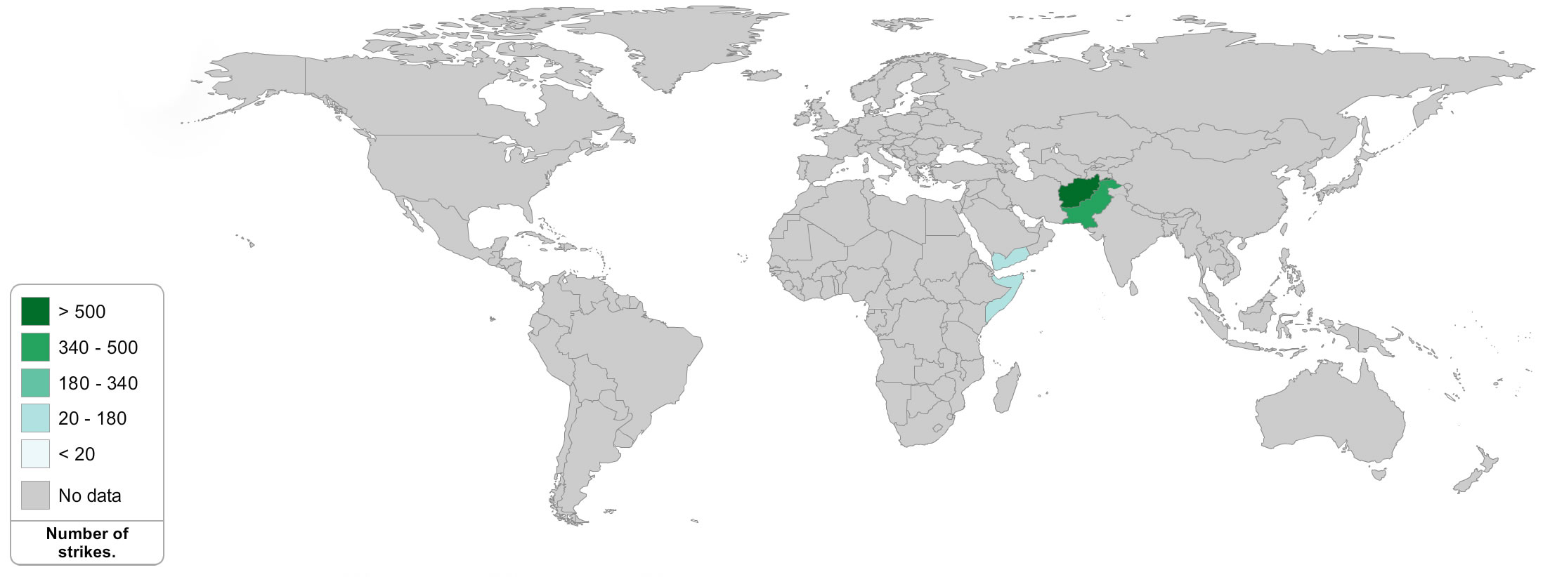
Here below is a similar map, using some of the same data, but displaying in particular missile strikes from U.S. drones. This relies on the reporting of the Bureau of Investigative Journalism.
Click to page 3 below to see where the weapons used in the world’s wars come from.